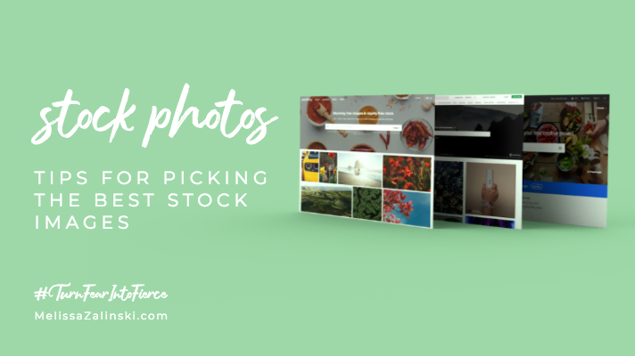
Take the guess work out picking stock photos by following these simple steps.
If you’re building your own website or putting together your own marketing materials, picking stock photos might be low on your priority list or not even on your radar. Images are often chosen without much consideration for how they fit into your branding and mesh with your website. As a result, stock photos can look out of place on your website when they should look cohesive.
So, how do you know which images to pick? I’ll outline a few guidelines below to get you started. But first, here are my favorite stock sites:
Unsplash – Completely free, large selection of images, and has a WordPress plugin called “Instant Images”
Pixabay – Completely free and has a great selection of images
Adobe Stock – Is subscription based and connects with Adobe Spark
Dupe – Another royalty free option that has more “real world” style of photos and less of the sterile stock photo vibe
Tip #1: Channel your inner designer
If you’re a DIYer, you also function as an Art Director. So let’s help you channel your inner designer!
Consider your branding
Hopefully you’ve put together (or had a designer create) brand guidelines. This should include your brand identity along with image styles. Always take into account whether or not the image represents your brand when making a selection. You wouldn’t want to use highly stylized stock photos if your aesthetic is more minimalistic, right? It’s important to take into account the feeling an image evokes, and if that feeling is in line with the values of your business.
Also take a look at the image’s colors. Is it really saturated or desaturated? Which one works better for your style? Is there a lot of red and orange, but your color palette is blues and greens? These things matter to the overall picture. Make sure the look of the image fits with your overall identity.
For more information on branding guidelines, read What to include in your branding
View the content critically
Take into consideration how you’re going to be using this image. Is it meant to reinforce content on your website? Or are you laying text over it for a social media post? If you intend on using it as a background, make sure the image isn’t too busy, that it’s not high-contrast (dark and light and not much in between), and that there aren’t patches of color that may interfere with your text.
Have spatial awareness
This requires a bit of visualization (or help from something like Canva, Spark, or an image editor). Imagine the space you want to fit the image into like a window. And the image is the landscape outside that window. Does the image fill that space? Are there important parts of the image that are cut off, like a face or part of a sign? It’s important to take the space where the image will live into consideration.
Tip #2: Search Smarter
There can be a wide variety of results when searching through stock sites, but there are a few things you can do to make sure you’re getting the most quality results.
Don’t be vague
The idea here is to narrow down your search results and pull out quality images. Searching for something vague like “nature” is going to provide a wide range of results, where searching for “path + forest” will provide something more specific.
If this image is meant to reinforce your copy, consider the big idea behind what you wrote and make some word associations. And if you’re not getting back the results you want, keep tweaking your search phrase.
Don’t be too specific
There’s a sweet spot here. Whereas being too vague will produce too many results, being too specific will produce too few. Sometimes it helps to click on an image that is close to what you’re looking for and see what tags are associated with it, then search for those tags.
Search for concepts or ideas
If you’re just not getting great results from your searches, try following one of your search terms with “thought”, “idea”, “feeling”, or “action”. A lot of interesting options will open up to you by combining a concept and a noun. For example: if you search “activism action” you’ll get more images of crowds, while if you search “activism idea” you’ll get more images of signs.
Tip #3: Be Technical
There are a few things besides the artistic nature of the image that you should consider when searching for an ideal stock image.
Bigger is better
This myth is right, at least when it comes to images! 😉 Depending on where you’re using the image, you’ll want to take notice of the image’s dimensions. You can always size down but sizing up is a no-no.
If you’re using it as a website banner, 1800px wide is a good starting point.
For print, every 300px = 1 inch, so take your print size and multiple it by 300. If you’re trying to fill an 8.5×11 paper, your image should be about 2,550×3,300
Never increase the size of the image
I’m an old-school designer who believes it’s never OK to upscale an image. You tend to lose image quality and it can make your final product look sloppy and unprofessional. I recommend you follow the “bigger is better” tip from above so this is never an issue.
Optimization is NOT optional
This is only important if you’re putting your image on your website. Optimization means to decrease the size of your image without losing much quality. The smaller the image size, the quicker your website will load. And if you have a lot of images, you’re going to want to make sure those images aren’t too big! A good rule of thumb is 300kb per image or less.
SEO is important
This is one of those things that you can get away with not doing. It won’t hurt anything to overlook it, but it won’t help your page rankings any. It’s good practice to give your images meaningful names and fill in the alt text and description. It helps you rank higher in Google search.
Additional Resources
How to check image size on a Mac: Locate your image in the finder and select it. On your keyboard, click the command and ‘i’ button at the same time (command + i). This will bring up an info window. The file size will be to the right of the name at the top, and the dimensions will be under “More Info” about midway down.
How to check image size on Windows: Locate the image in your Windows Explorer and select it. The size and dimensions will be located at the bottom of the explorer window.


