Overview
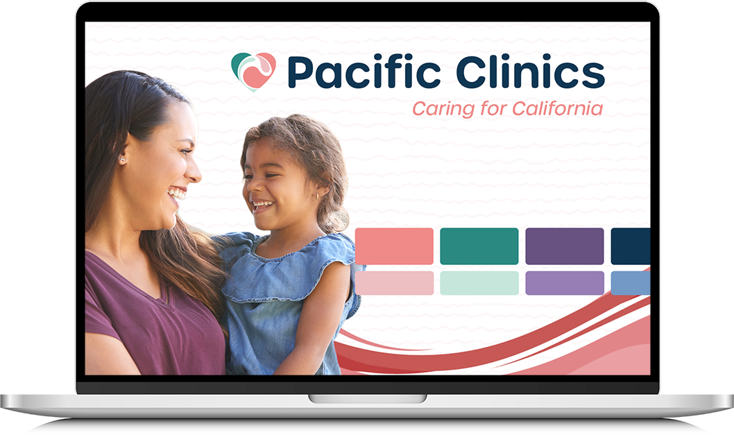
When Uplift Family Services merged with Pacific Clinics, we were tasked with combining the two brands into one while preserving elements from both. From the logo to branded visual and print materials, the new organization was left with a completely refreshed and functional brand identity.
A new beginning
Uplift Family Services and Pacific Clinics were two of the most prominent behavioral healthcare providers in California. These two non-profits provided care for more than 50,000 people every year – each serving a wide range of clients but different demographics. Eventually, they made the decision to come together with the goal of better serving an even larger population. Combined, they’re now referred to as Pacific Clinics.
This decision to merge the two organizations meant great news for Californians; it also came with the tall task of integrating two well-established brand identities into a new one. The very talented communications team at Ocean & Mountain were brought on for the monumental task, but they needed a designer to bring everything to life. That’s where I came in.

Time to plan
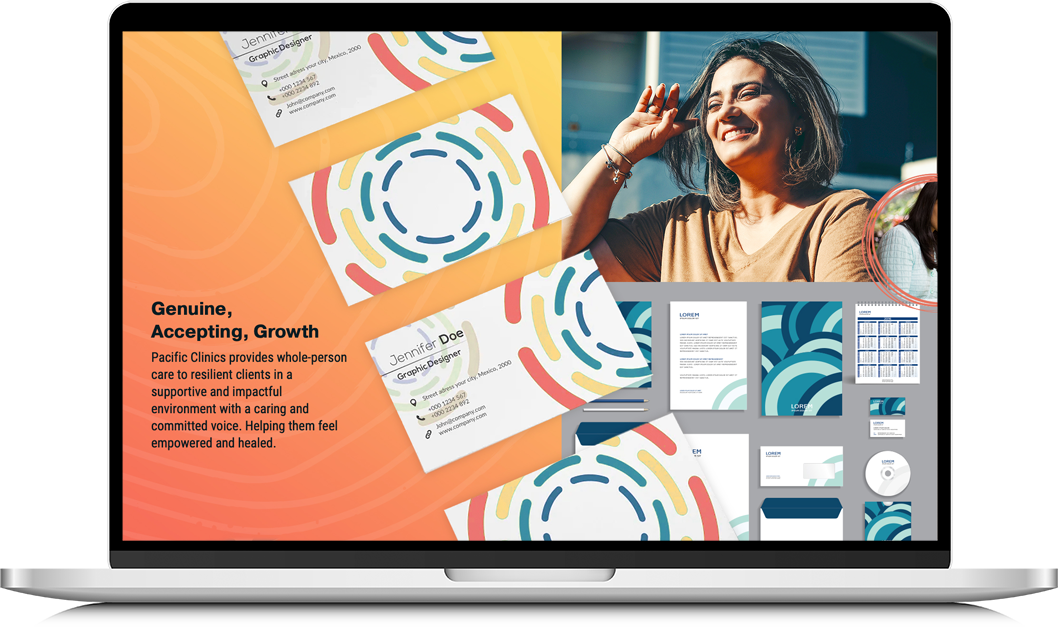
Rebranding into the updated Pacific Clinics required fully updated brand guidelines, identity design, and a logo. Because we wanted to pull elements from each brand, it was important for us to first create new rules for the updated branding. These rules eliminated much of the back-and-forth that often comes with design projects. From there, we pulled in pieces of the old identities that we knew would fit. Putting this much time and effort into developing the brand’s visual identity meant that we had a much easier time creating collateral and the design process required little guesswork.
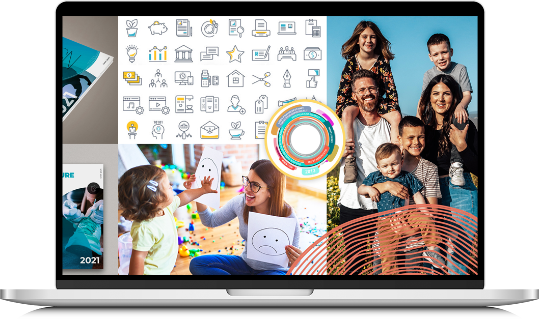
This work started with in-depth research internally with both organizations and externally with the audiences they serve. We held a workshop with more than 30 stakeholders that included team members from every level of the organizations. During this workshop, we discussed the hero’s journey and the different client types, services provided, attributes that describe the organization and its personality, and the impact the organization has on its community. By the end, we had a wealth of information that gave us a clear, big-picture idea into what the new brand was all about.

Putting pen to paper
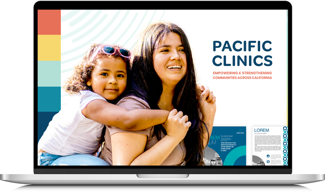
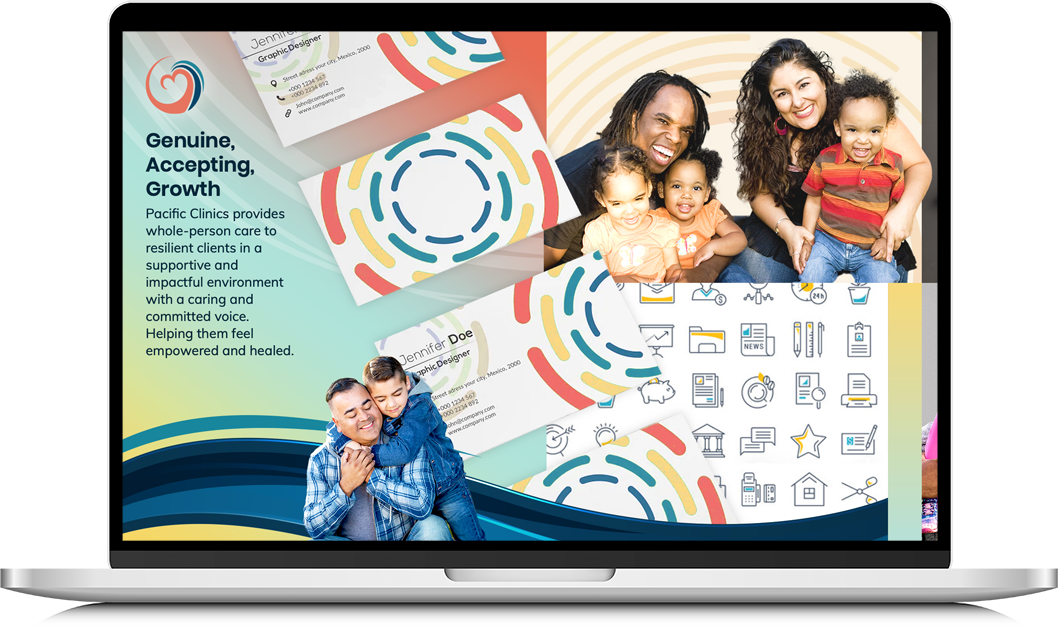
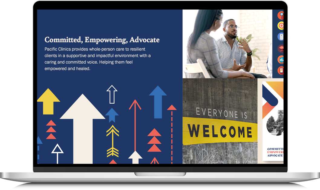
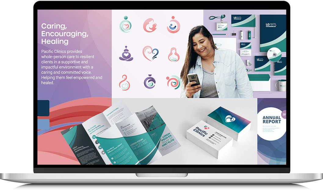
Creating a visual identity
Our next step was to take all of that information and translate all of those thoughts and ideas into visual representations. Providing three stylescapes gave us a starting point for the identity, and from there we honed the look and feel of text, images, and graphics. This gave us a blueprint for everything brand related moving forward, taking the guesswork out of our decisions and providing their communications teams with clear design guidelines.

Putting a face to the name
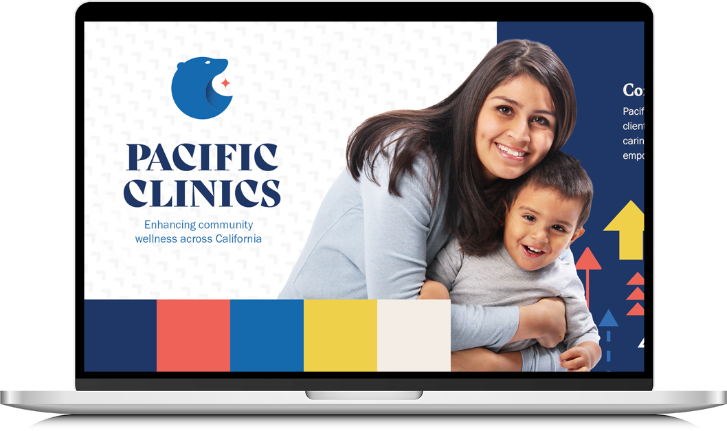
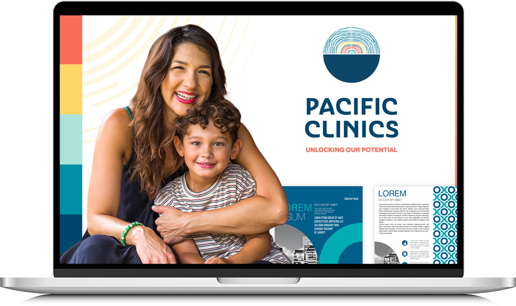
Our next hurdle to overcome was the logo. Thankfully we already had graphic elements that could point us in the right direction, so it was a matter of creating a symbol that was both iconic and representative of the care the new organization would provide for their audience.
Elements that Pacific Clinics loved were:
- a heart, as the existing UFS logo was a heart in hands
- waves, to represent the flow of care provided
- a person/people, since they’re a person-centered organization
- the idea of being held or embraced
With this style in mind, and after many drafts and brainstorming sessions, we finally landed on a logo that the entire team could get behind. It was a daunting task to create something that would appease so many people, but in the end we were successful.
The final touches
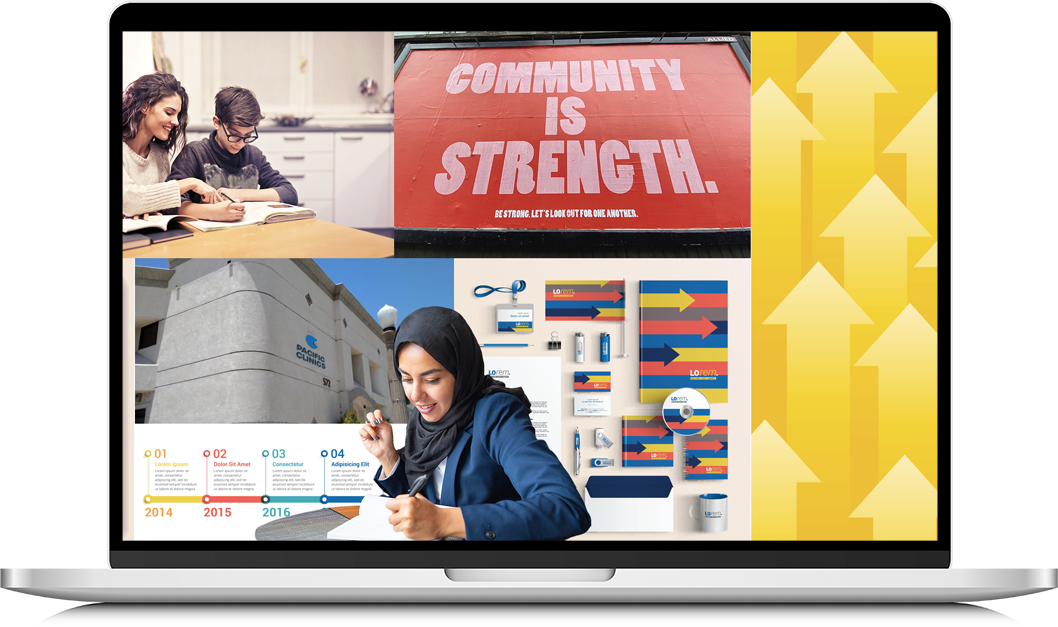
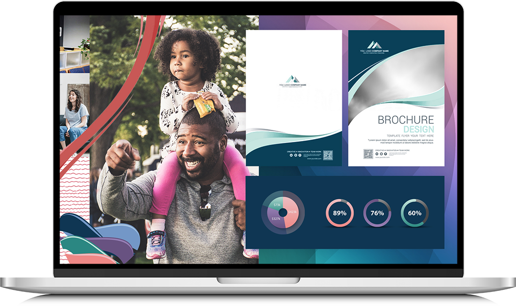
From here, it was smooth sailing. Our next order of business was to ensure all visual and print materials were consistent. This meant stationary, brochures, flyers, even Zoom backgrounds and PowerPoint templates – all things necessary for Pacific Clinics to present as their new brand.
This project required us to be tedious in our planning and our execution, but in the end it meant that Pacific Clinics could focus all of their efforts on serving the population of California. Since its launch, the new brand identity has helped them make cohesive business decisions and been incorporated into their marketing materials. This new identity so closely exemplifies the ethos of Pacific Clinics that they will be able to build off of it for years to come.